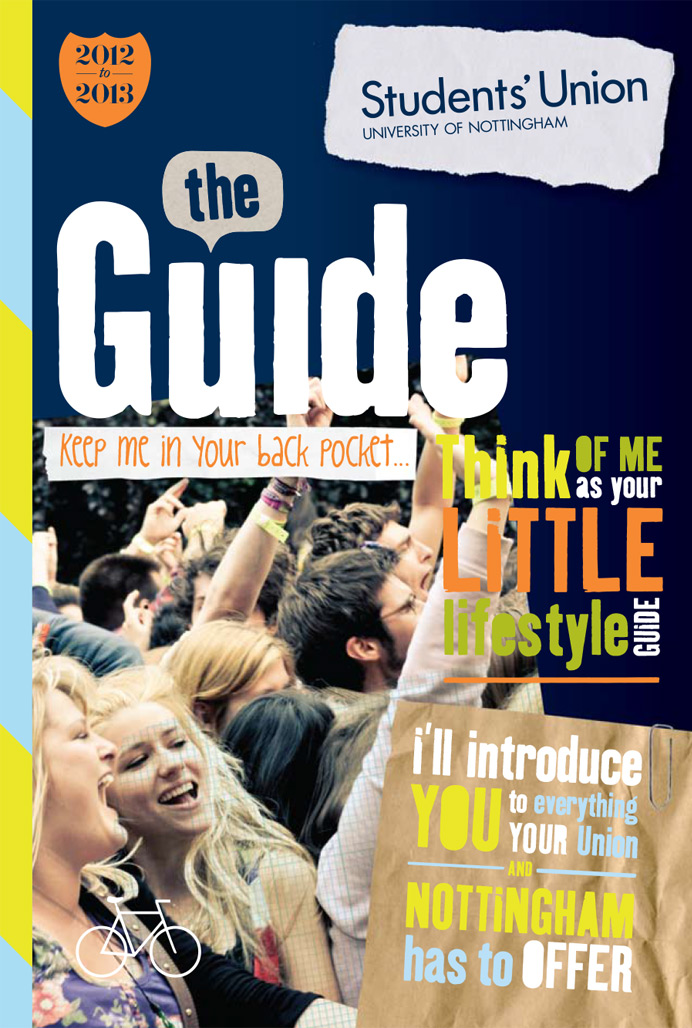
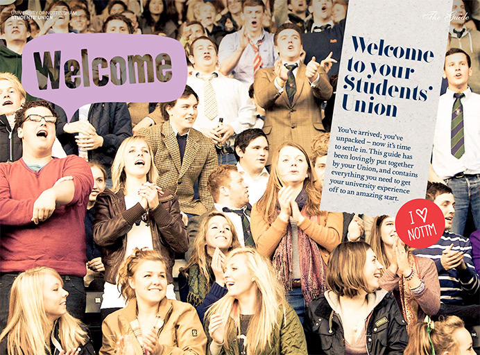
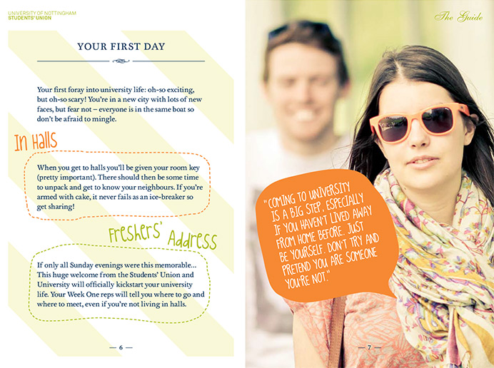
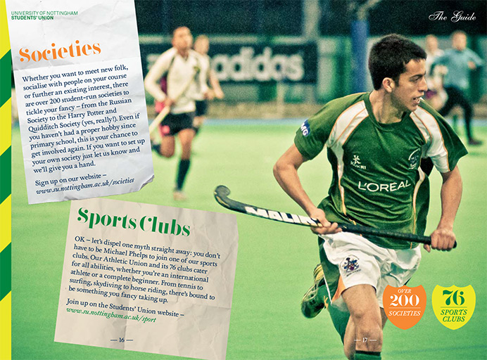
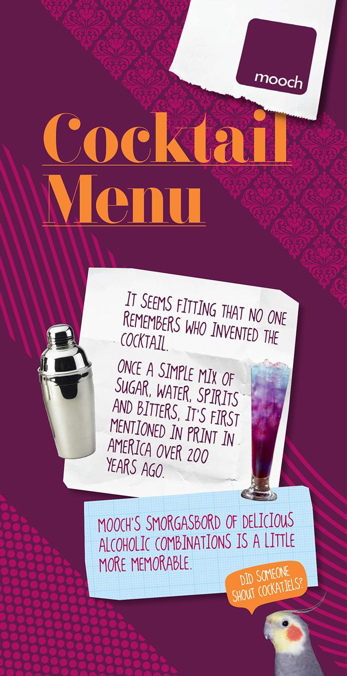
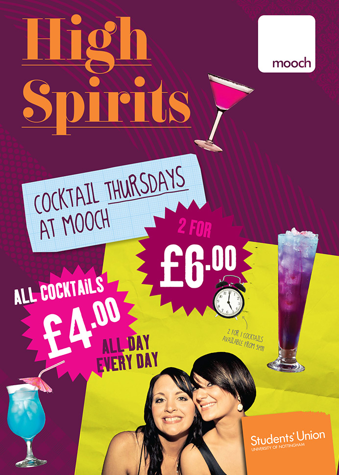
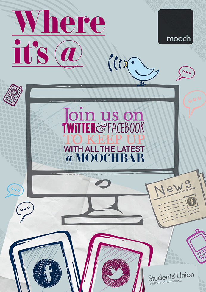
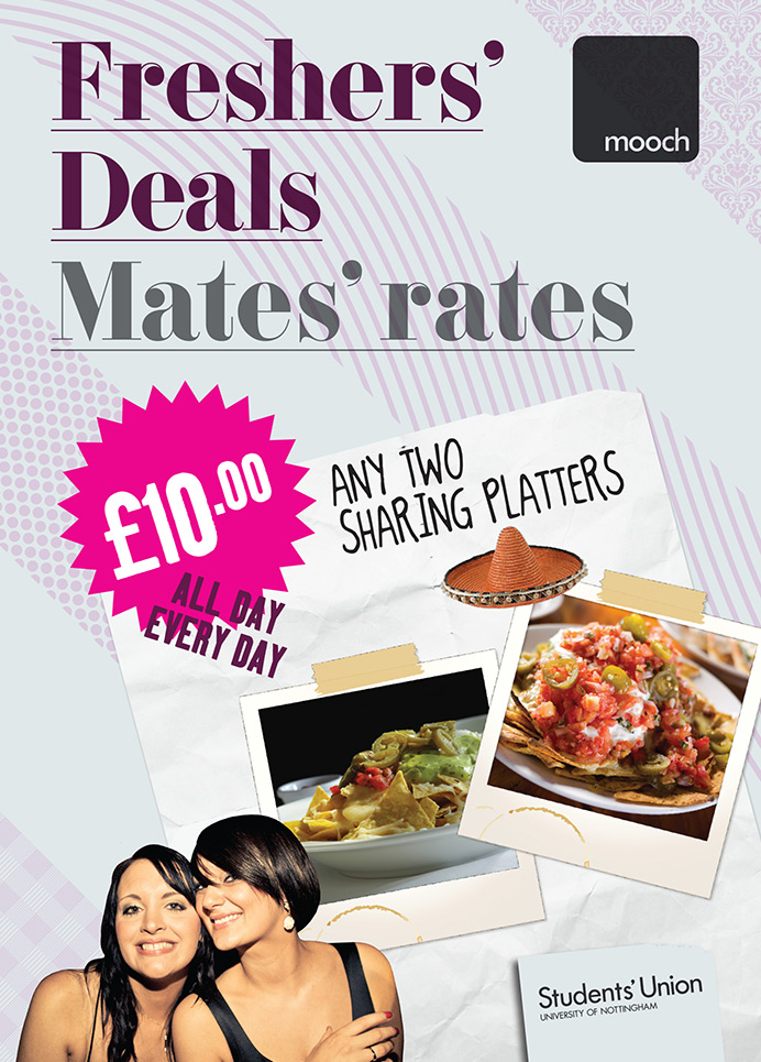

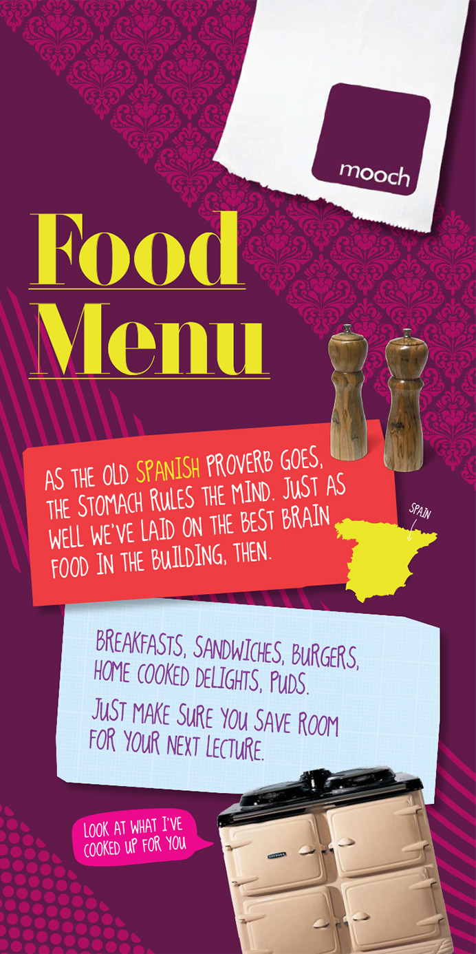
Irreverence, fun, wit and playfulness were order of the day when Nottingham’s Students’ Union asked for a new look and tonality that differentiated them clearly from the university. We started by giving their freshers’ materials a total overhaul – from posters and menus for the union bar, Mooch, to a printed Freshers’ Guide and microsite specially for first-year students. I centred my writing around the theme “welcome home”, which went on to underpin the union’s five-year communications strategy.
Nottingham University Students’ Union: branding
- Categories →
- Branding
- Digital
Portfolio
-

Rental living by Legal & General: branding, key messaging and microsite copy

-
Canonbury corner: branding, TOV & brochure
-
Slimming World: internal communications
-
Iceland: brand development, packaging, advertising
-
Ghost writing: autobiography
-

Center Parcs: Signage
-
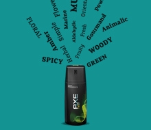
Axe: brand book
-

British Airways: Radio ads
-
Nottingham University Students’ Union: branding
-
Trent Bridge: brochure
-
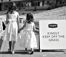
Trent Bridge: branding, marketing and signage
-

Audi: integrated
-
Audi credit card: branding
-

Audi: billboard
-

Audi: point of sale
-

Go Ape: brand guidelines
-
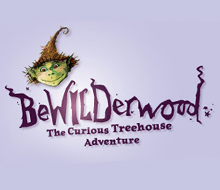
BeWILDerwood: signage
-
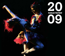
Birmingham Royal Ballet: annual review